Colophon
How this site is made.
- Process
- The words came first. I wrote the story of the site and every section's copy in a working document before anything was designed. The look was explored in Claude Design, and the site was built with Claude Code from that document. Since the products I have designed recently are hard to show in action, the site itself is where you can see how I work.
- Design influences
- The geometry is Bauhaus: five squares, a grid, nothing that cannot be drawn with a ruler. The typography and spacing come from the Swiss International Style of the 1950s and 60s, where hierarchy does the work decoration used to. The labels, the monospace metadata and the flat color blocks are a nod to the industrial and editorial graphics of the 1960s to 80s: instrument panels, technical manuals, magazine mastheads. The result sits close to what people now call web brutalism or utilitarian design, which I read as the same idea: show the structure, say what things are, and let the content carry the page.
- The mark
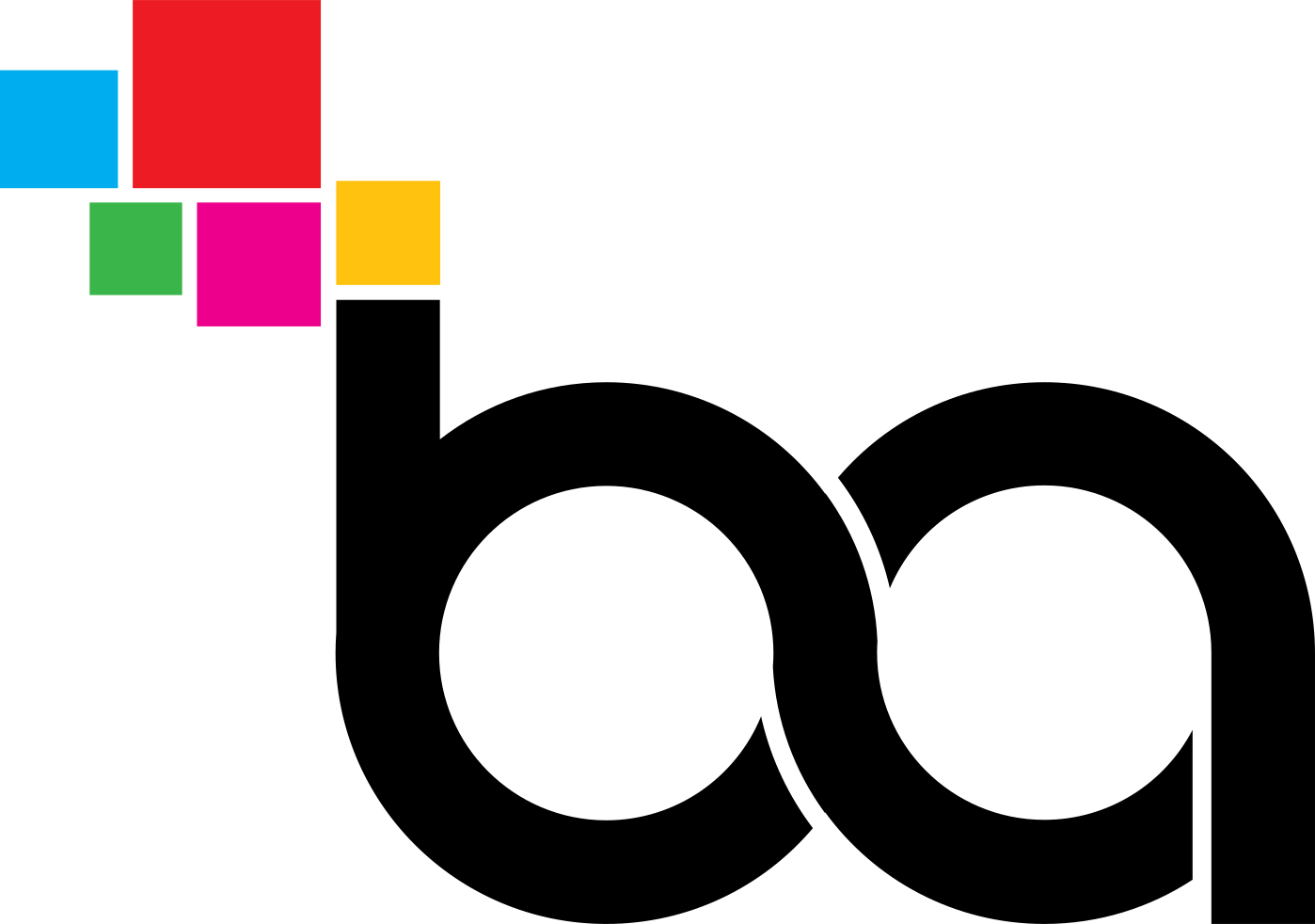
- I drew the "ba" mark myself, in the spirit of Bauhaus geometric modernism with some play in it. It is a compact monogram: my initials in black lettering, connected into a shape that reads like an infinity loop, which is how I think about my work, through connections, feedback loops and continuous learning. The black lettering is structured and assured; the five colored blocks are curious, inventive and approachable. Their colors come from printing inks, pixels and early computer graphics, a lifetime association with making, reproduction and digital tools. The blocks can also be read as separate parts forming a system, which is what most of my work is about. On this site the five squares become five cubes inside a wireframe plot, drawn with three.js. From one angle they line up as the logo; from every other angle they are five solids at different depths. Drag it and it finds its way back.
- Type
- Barlow Condensed for titles and Barlow for text, a grotesque drawn from California's road signs and license plates, which is the industrial lineage above in a typeface. IBM Plex Mono for labels and metadata, because the site is partly about systems and the mono face reads as a system talking. Served by Google Fonts.
- Clips
- The interaction clips on the work cards are recorded with ui-clips, a Claude Code plugin I built for the purpose and released under Apache 2.0: github.com/banuakman/ui-clips. It records a scripted walk through a prototype or a live site, with the pointer and zoom handled by the plugin rather than by hand.
- Build
- Hand-written HTML and CSS, rendered from a small content file by a Node script. No framework. Visits are counted with Vercel's cookie-free analytics; no personal data is collected. Hosted on Vercel.